
Mastering CSS Sizing Units
CSS sizing units are critical tools in web design, impacting everything from layout responsiveness to accessibility. This guide will help you understand the different types of sizing units and when to use each.
Understanding CSS Sizing Units
CSS units are the measurements used to define width, height, font size, margins, and more. They are grouped into four major categories:
-
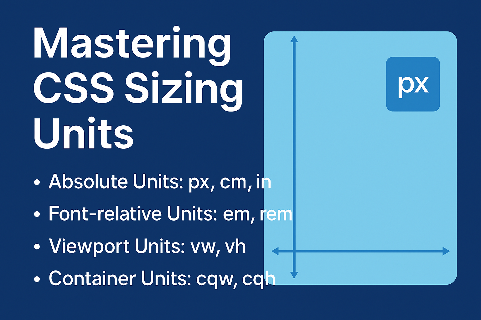
Absolute Units (e.g., px, cm, in)
-
Font-relative Units (e.g., em, rem, ch)
-
Viewport-relative Units (e.g., vw, vh)
-
Container-relative Units (e.g., cqw, cqh)
Each type of unit behaves differently depending on the device, container, or typography settings.
Absolute Units
Absolute units are fixed measurements, often tied to real-world dimensions (like inches and centimeters). On screens, however, units like in and cm are converted to pixels based on a standard resolution (commonly 96 pixels per inch).
Common absolute units include:
-
px (pixels)
-
cm (centimeters)
-
in (inches)
-
pt (points)
Absolute units are great for print stylesheets but are less flexible for responsive design.
Font-relative Units
Font-relative units scale based on font size settings, making them ideal for accessible, scalable layouts.
Key units:
-
em: Relative to the font size of the current element.
-
rem: Relative to the font size of the root element (html).
-
ch: Width of the "0" glyph.
-
ex, ic, lh: Based on font-specific metrics like x-height and ideographic characters.
Use font-relative units to ensure your typography adjusts smoothly to user settings or device zoom levels.
Viewport-relative Units
Viewport units adapt to the size of the browser window or device screen:
-
vw: 1% of the viewport's width.
-
vh: 1% of the viewport's height.
-
vmin/vmax: 1% of the smaller or larger dimension (width or height).
Viewport units are excellent for creating fluid layouts, hero sections, or responsive typography.
Container-relative Units
A newer addition to CSS, container-relative units depend on the size of a containing element rather than the whole viewport.
Examples include:
-
cqw: 1% of container width.
-
cqh: 1% of container height.
-
cqmin/cqmax: Min/max dimensions of the container.
They offer finer control inside components, making layouts even more modular and responsive.
Best Practices
-
Use relative units like em and rem for font sizing to enhance accessibility.
-
Apply viewport units for full-width or height layouts that must adapt across devices.
-
Reserve absolute units for print media or when precise sizing is critical.
-
Leverage container units for highly flexible component-based designs.
Choosing the right unit can drastically improve your site’s performance, readability, and adaptability.

0 Comments Add a Comment?