
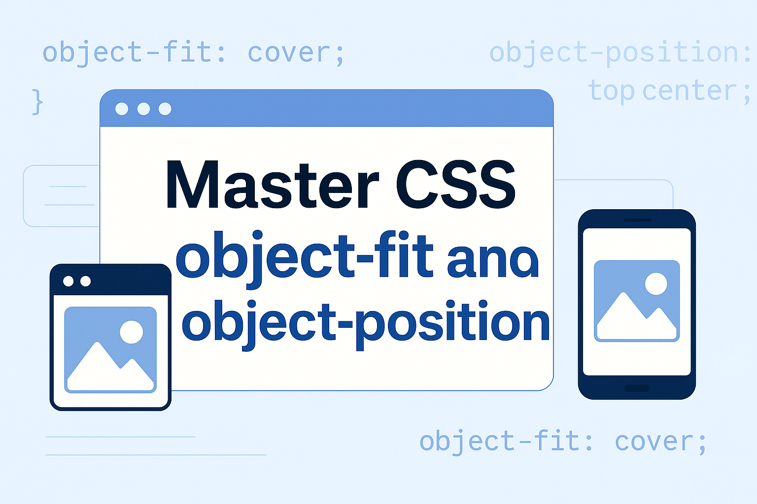
Master CSS object-fit and object-position
Modern web design demands responsive, visually appealing images and videos. But scaling media correctly can be tricky. This is where CSS properties like object-fit and object-position come to the rescue. In this guide, you'll learn what they are, how they work, and best practices for using them effectively.
What Is object-fit in CSS?
The object-fit property defines how an <img> or <video> should resize to fit its container while preserving its aspect ratio.
Modern web design demands responsive, visually appealing images and videos. But scaling media correctly can be tricky. This is where CSS properties like object-fit and object-position come to the rescue. In this guide, you'll learn what they are, how they work, and best practices for using them effectively.
Available Values
-
fill (default):
Stretches the media to fill the container, which may distort the aspect ratio. -
contain:
Scales the media to fit inside the container while maintaining its aspect ratio. Some empty space may remain. -
cover:
Scales the media to completely cover the container. The media might be clipped to maintain its aspect ratio. -
none:
Keeps the media's original size, even if it doesn't fit inside the container. -
scale-down:
Similar to none or contain, whichever results in a smaller size.
Practical Example: object-fit in Action
Here’s a basic example showing how object-fit can improve image handling:
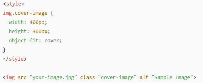
In this example, the image covers the entire 400x300 pixel container, cropping if necessary to maintain its aspect ratio.
What Is object-position in CSS?
While object-fit controls the size and scaling, object-position lets you control where the media is placed inside the container.
Common Use Cases
-
Center an image:
- Top left alignment:
- Custom position (e.g., shift 20% from left and 30% from top):
Example: Fine-Tuning with object-position
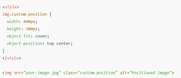
- In this case, the image is anchored from the top center rather than the middle.
Why Use object-fit and object-position?
-
Responsive design:
Makes images and videos scale perfectly across devices. -
Better user experience:
Avoids ugly image distortion or unexpected white spaces. -
More control:
Designers and developers have precise control over how media is displayed. -
Minimal code:
Achieve powerful effects with just a few lines of CSS.
Browser Support
Good news!
Both object-fit and object-position are supported in all major modern browsers, including Chrome, Firefox, Edge, Safari, and Opera. However, for IE11 and earlier, you might need fallback solutions.
Best Practices for Using object-fit and object-position
-
Always provide a fallback if supporting very old browsers is critical.
-
Use object-fit: cover for hero images and banner designs.
-
Combine object-fit and object-position to fine-tune how the media appears.
-
Add descriptive alt tags to images for better accessibility and SEO.
Conclusion
Using CSS object-fit and object-position properties can significantly enhance the responsiveness and visual quality of your websites. With just a few simple rules, you can ensure that your images and videos look stunning across all devices.
Start experimenting with them today and take your web design skills to the next level!

0 Comments Add a Comment?